Eight of the world's most vibrant buildings
Visionary architects have always used colour to enrich the built environment. From an exuberant historic temple to a lively public library, these eight buildings place colour at the heart of their design.
Human beings have used colour to inspire pleasure for hundreds of thousands of years. Neanderthals applied natural earth pigments to cave walls, beginning a tradition later continued in the painted temples of ancient Egypt and Greece and the richly patterned marble architecture of Rome. Across cultures and centuries, colour remained a fundamental part of construction.
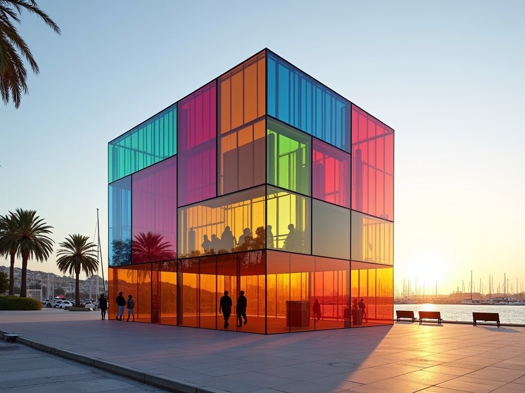
It took centre stage in the stained glass of medieval churches and across the frescoed walls and ceilings of Renaissance Italy. Colour has also defined the polished surfaces of architecture from the late 20th and early 21st Centuries, including Daniel Buren’s cubic entrance to the Pompidou Centre in Malaga, where light and vivid hues work together.
Designer Adam Nathaniel Furman and author Kate Mazade describe colour as the essential element that can give architecture otherwise unattainable levels of emotional power, character and delight in Chromatic Architecture – the Craft of Colour in Design.
Their new book presents eight strikingly colourful structures. Together, these buildings encourage architects to work with colour more boldly and invite the public to recognise the extraordinary possibilities it offers.
India’s southern state of Tamil Nadu has a long and celebrated tradition of colourful architecture. Construction of this temple began in the 1st Century AD and continued under several dynasties until the late 20th Century. The resulting religious complex is among the world’s largest, extending across more than 150 acres.
It is marked by 21 monumental gateways, known as gopurams, whose sculptural surfaces are covered in brilliant pigments. Furman says the complex overflows with spiritual energy, made tangible through colour that draws visitors and worshippers away from ordinary life and towards contemplation, awe and wonder.
Completed in 1908, this concert hall came to represent Catalonia as a wealthy, culturally independent region undergoing rapid industrial growth. Architect Lluís Domènech i Montaner combined Art Nouveau with Romanesque and Gothic Revival influences, adding Moorish patterns and elements drawn from Valencian craft traditions.
In Furman’s view, every feature of the Palau carries symbolic meaning and could belong within an enchanted forest. Each stone, baluster, arch block, column, capital, lamp and handle is infused with decorative detail and colour, making the building appear almost magically alive.
Residents know this 1929 office tower by Wirt C Rowland as the “Cathedral of Finance”. It is also widely regarded as one of the most important Art Deco skyscrapers ever constructed.
Mazade explains that Rowland used colour to celebrate the broad range of skilled crafts practised around the American Great Lakes during the early 20th Century.
The exterior is wrapped in almost two million warm, orange-toned bricks and terracotta pieces. Inside, the principal lobby rises beneath a three-storey vaulted ceiling covered with a quilt-like arrangement of tiles in strong primary colours.
The tower originally proclaimed Detroit’s commercial confidence and prosperity. Today, Mazade adds, it remains a spirited and uplifting reminder of that period.
The Italian architect, artist and designer Gio Ponti is said to have based this 1969 scheme on the lush, irregular grid of Dutch farmland observed from an aeroplane. A large building without windows might have defeated many architects, but Ponti—an influential figure in Modernism alongside Le Corbusier and Mies van der Rohe—approached it imaginatively.
He converted the façade into what Furman describes as an immense, shimmering landscape of emerald colour. By doing so, Ponti transformed a potentially bleak concrete elevation, typical of its era, into a genuine work of modern urban art.
This 2005 rental development was created in tribute to American disability-rights advocate and author Helen Keller. The nine lofts, designed by Shusaku Arakawa and Madeline Gins, are presented as a futuristic collage of brightly coloured cylinders, cubes, spheres and contemporary construction elements. Together, they form an immersive living environment in which every fitting and surface pulses with chromatic intensity.
Artist Arakawa and poet Gins deliberately chose colours intended to unsettle the occupants’ sense of balance. They believed that environments encouraging people to escape passive domestic routines might help them live longer, Mazade explains. Sloping floors and spherical rooms were paired with an overwhelming sensory palette, supposedly for the residents’ physical and mental benefit.
Austrian artist and architect Friedensreich Hundertwasser died in 2000, one year before this building was finished. He rejected the flat uniformity of Modernism and promoted architecture as a changing, living organism rather than a machine designed only to perform narrowly prescribed tasks.
Hundertwasser applied this philosophy to industrial structures as readily as to homes. The Maishima plant resembles an eccentric storybook castle and is frequently confused with a nearby theme park. Loose yellow stripes seem to trickle down its lower sections, while a tall cylindrical tower carries similar bands in red. Throughout the complex, even the projecting forms rest on short, rounded supports decorated with coloured blocks.
Mazade considers every aspect of the building an act of defiance. A waste-processing facility with an aqua chimney, chequered walls and stripes of sunflower yellow and scarlet could hardly be more rebellious.
Completed in 2019, this public library and municipal archive by BN Asociados Arquitectos turns its contents into an architectural metaphor. Large, rounded pastel ceramic pieces cling to the building’s curved exterior, suggesting the number and variety of books stored on the shelves within.
The distinctive façade also gives a newly developed Madrid neighbourhood a much-needed cultural landmark. As daylight travels across the scalloped ceramic surfaces, Mazade notes, their muted pastel shades and matte finish create an appearance reminiscent of paper.
This 50-metre pedestrian passage in Croydon, a town not usually celebrated for its architecture, consists of 16 enormous columns and two substantial walls. Created in 2003 by Adam Nathaniel Furman, it is covered with thousands of handmade, three-dimensional porcelain tiles. Every tile carries a dense, translucent glaze, shifting from deep underwater blue at the base to soft cream-white above.
The project brings memorable traditions of colour from different periods and cultures into the surroundings of East Croydon railway station.
Furman explains that the colours immerse pedestrians in a rich and sensuous setting. They evoke thousands of years of blue-and-white architectural ceramics used on monumental buildings across the world, from ancient Egypt and Babylon to Portugal, Turkey and Safavid Iran.
Chromatic Architecture – the Craft of Colour in Design by Adam Nathaniel Furman and Kate Mazade will be published on 1 September 2026.